Brand identity
Lucas’ Fitness Lab (LBL) is a nonprofitable organization based in Queens, NY who is dedicated to providing the tools for children to build fit bodies and fit minds. Their after school programs offer access to STEM educations and fitness materials for the students. The project was created through an ongoing pro-bono initiative from Ideas On Purpose, called Brand New Brand, where the company selects a small nonprofit organization who makes an impact on their community, and offers them free rebranding. Unfortunately, due to the circumstances that were caused from the pandemic, the company was unable to utilize the rebranding we had provided.
Lucas’ Fitness Lab
My Contributions
Logo Design
Print Collateral
User Experience
Web Design
Branding Research
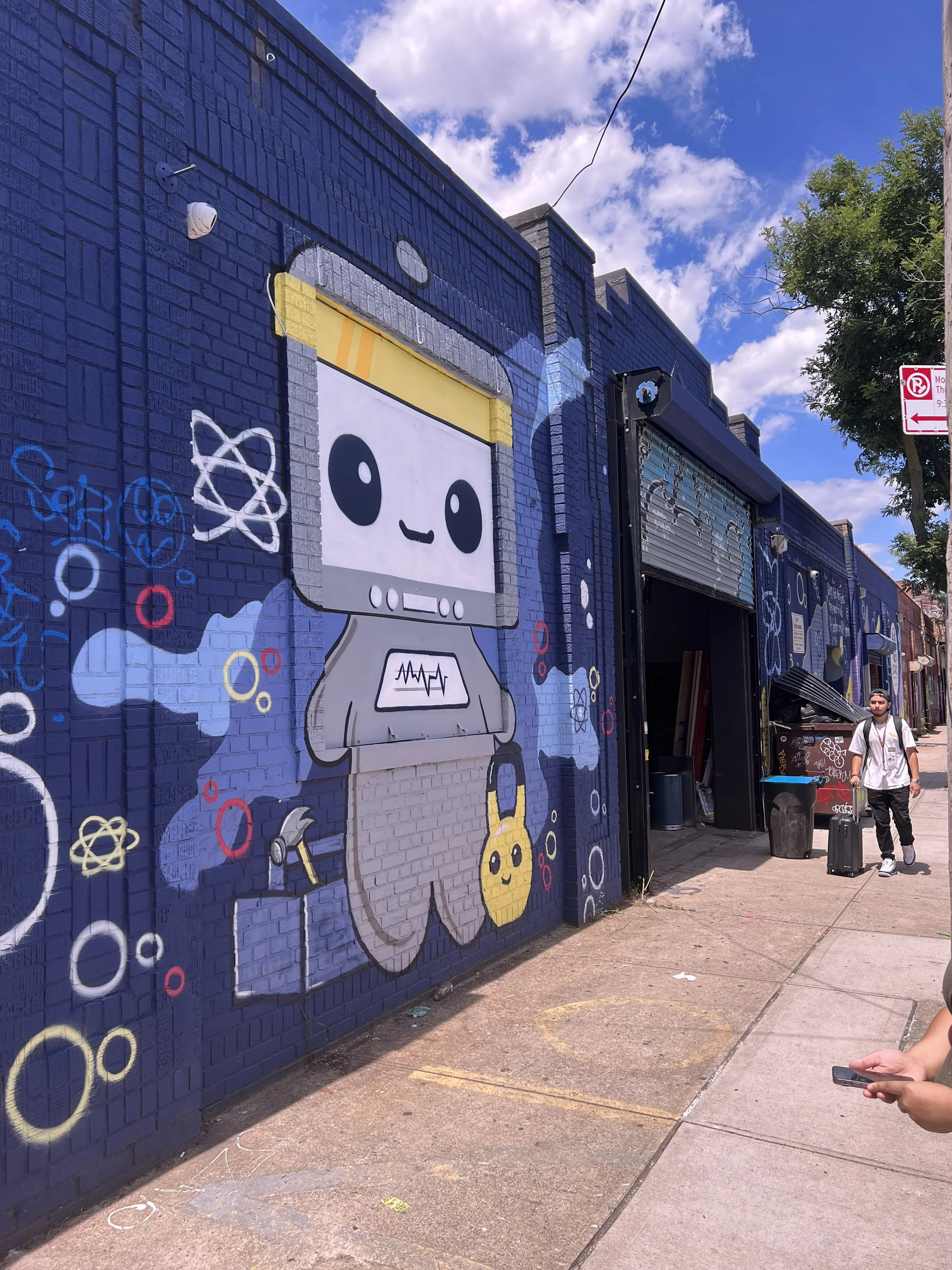
We began our research by visiting Lucas Fitness Lab. They were gracious enough to allow us to tour their facilities, gathering information from the employees, owner, and clients.
Their objective
Their objective is to expand their outreach for new partners, donors, and enlarge their overall audience. A new brand presence that showcases who they are, what they provide, and how they cooperate with other nonprofits; they hope their presence will expand to five boroughs in NYC within a year.
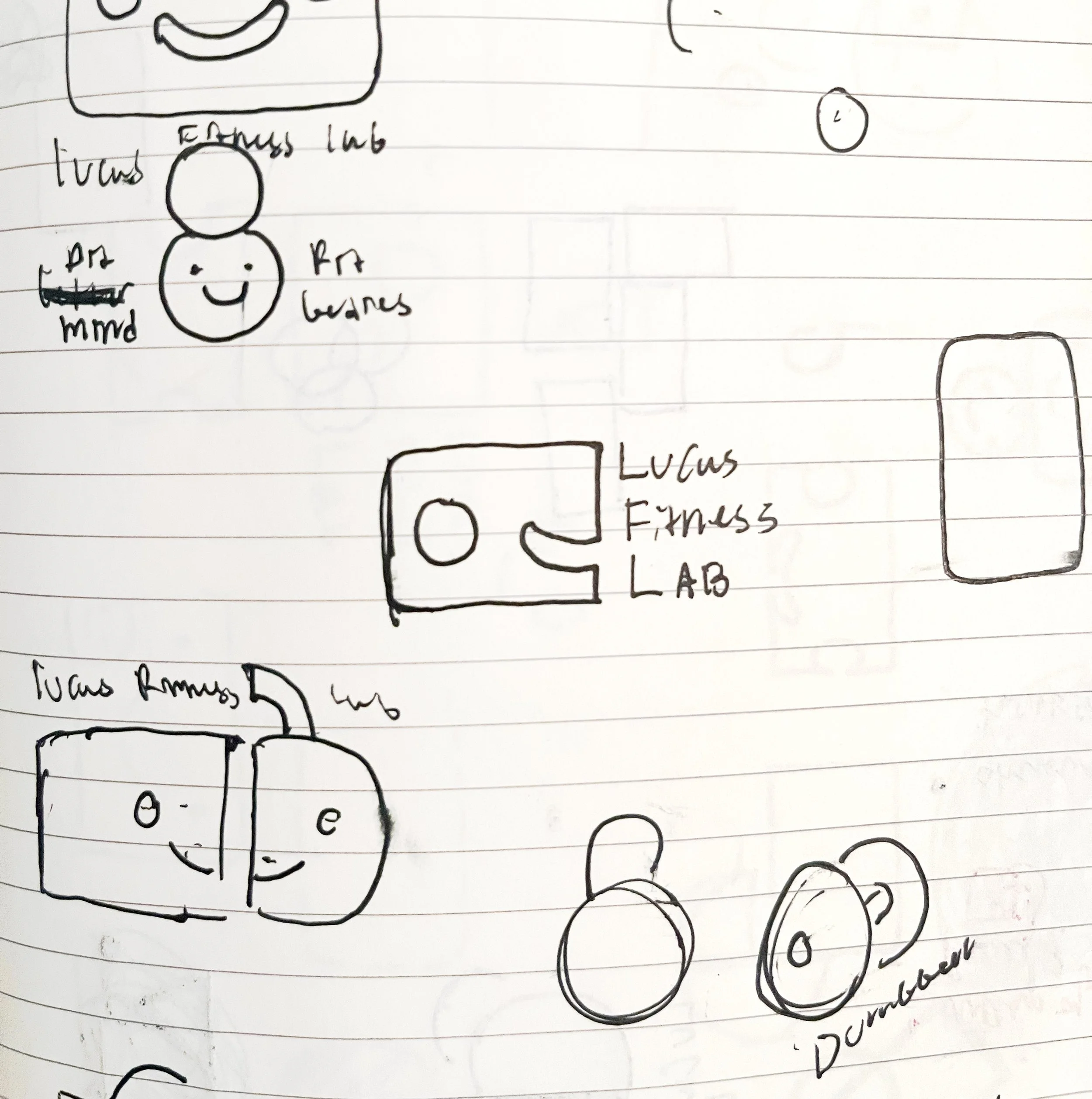
Once we gathered information from the client and finished our own research on other nonprofits, we began our process with sketching concepts. The brand attributes we started with were, curious, creative, empathetic, collaborative, and resilient.
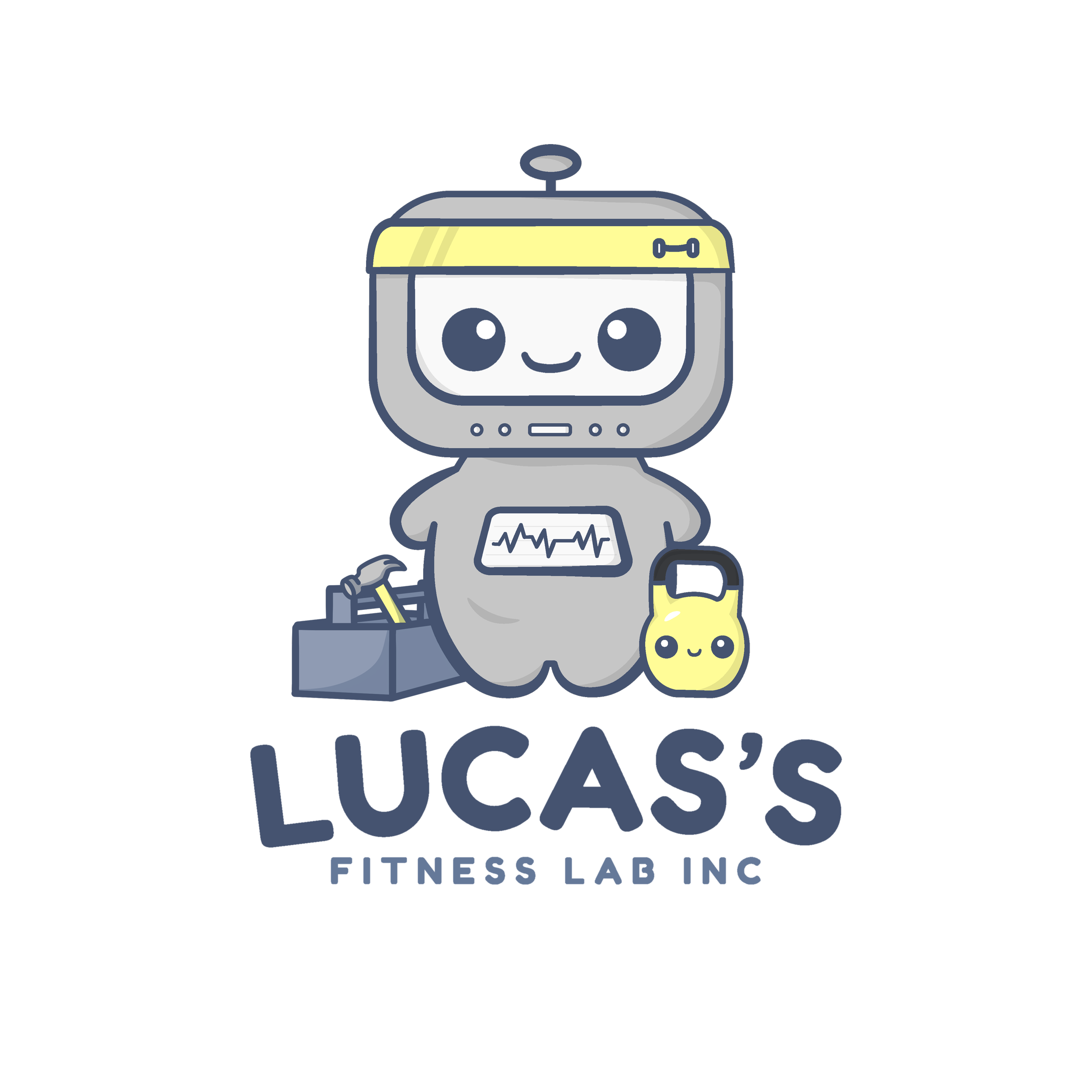
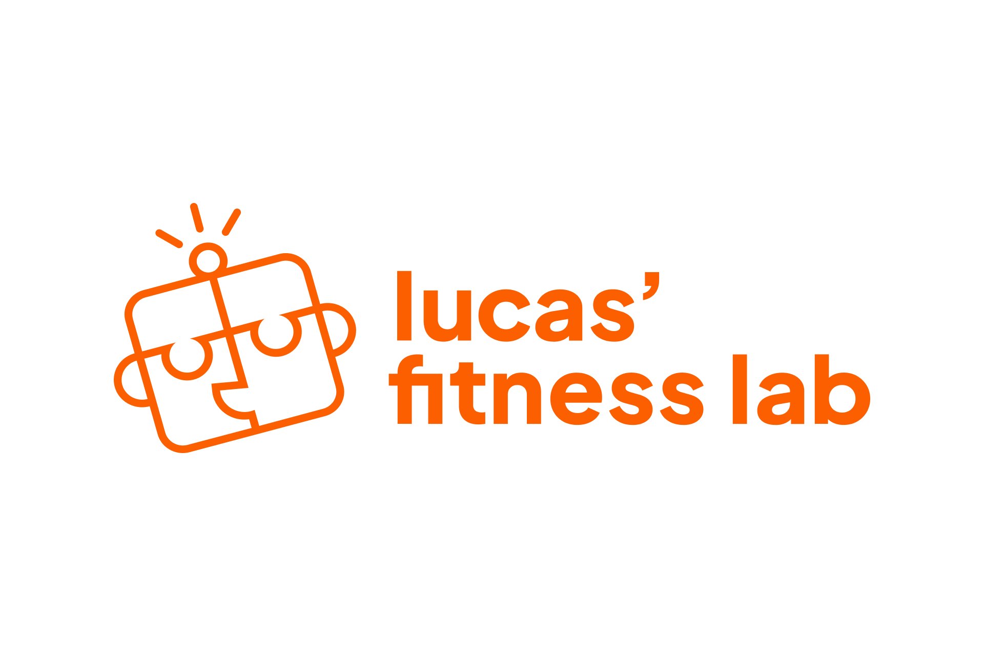
We had weekly check-ins to share sketches, concepts and our overall progress. During my own explorations I focused on preserving the characteristic of their current logo; a robot named Lucas’ who was inspired by the founder’s child named Lucas. There was a quality to the robot that we adored and this encouraged me to explore the design of the robot. Through my creative process I ended with a robot that resembles a puzzle piece, encouraging the idea of play and exploration.


Web Development
Throughout the branding identity process, we began to explore how the website would be structured; focusing on their targeted audience and potential donors. The sitemap was created through team collaborations based on how the navigation would function.
Wireframes were created to view the layouts and functionality of the webpages.

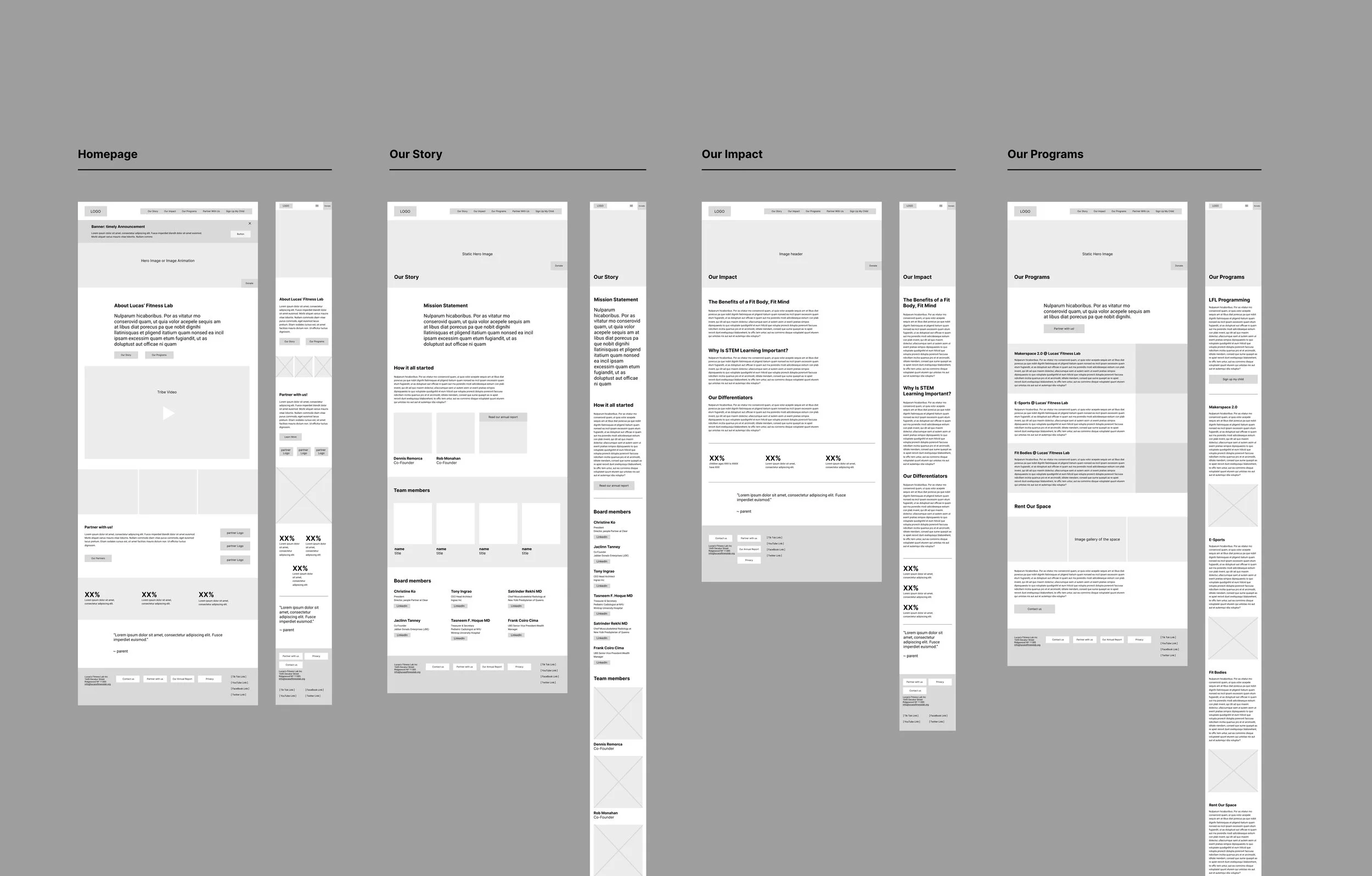
The designers alternated throughout the process of website’s design, ensuring it is functional and visually appealing. With the wireframes and branding completed. With the branding aspects nearing completion, we implemented the components into the wireframes. Each designer participated in the designs. As the brand was becoming more refined so did the website.

